
Gallery
From First Sketch to Finished Combat UI
The combat window and combat UI for Veildelve are taking shape step by step – starting from a functional basic structure and moving toward the final visual interface.
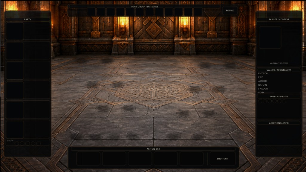
A current focus in the development of Veildelve - A World Shaped by Aether is the combat window and combat UI. Instead of jumping straight to a finished look, I deliberately start with a simple sketch: frames, panels, and rough positions.
At this stage, the final appearance is not the point yet. First I need to figure out which information belongs where – and which areas will even be needed later.
Six characters need structure
Veildelve uses a party of six characters. That means the combat window has to keep a fair amount of information readable at once: your own formation, enemies, summons, character details, and later actions and abilities.
At the same time, the actual battle scene should retain as much space as possible. The more UI elements pile up, the easier it is to lose sight of what is happening in the fight. So I build the functional structure first and then test sizes, positions, and spacing directly in the game.
From placeholders to a visible interface
Only once the layout works in live combat do the placeholders gradually turn into the final visual UI. Not every idea from the first sketch has to survive into the finished design. Some areas shift, others disappear or get merged.
This development blog is meant to show these early development states as well – not only finished results. The images in this post are exactly that: early development states, and explicitly not a final UI.
What comes next
Next, the areas will continue to be adjusted in the game context. The goal is an interface that fits Veildelve’s dark fantasy style, remains clear, and can be understood quickly during combat.
Early basic structure
The first sketch only defines which areas exist and roughly where information should sit – with no final design yet.
Early prototypeFunctional UI layout
The areas become clearer: party on the left, target and resistance info on the right, initiative at the top, and the action bar at the bottom.
Early prototypeIntermediate state in context
The same structure over a real scene – a test of how much room the battle scene keeps and how the placeholders feel in context.
Early prototypeNote on the images:
The images shown are early development states of the combat UI and are explicitly not the final interface. Sizes, positions, and content may still change as development continues.