
Gallery
Inventory and Character Stats – Focusing on UI and UX
The inventory, equipment, and character stats interfaces for Veildelve have reached their current visual state, with a focus on clarity, readability, and a consistent visual language.
A role-playing game like Veildelve - A World Shaped by Aether communicates a large part of its systems through its user interface. Inventory, equipment, and character stats in particular need to present a lot of information at once without becoming difficult to read.
That is why one of my recent focuses has been the UI and UX of these two central areas.
Inventory and equipment at a glance
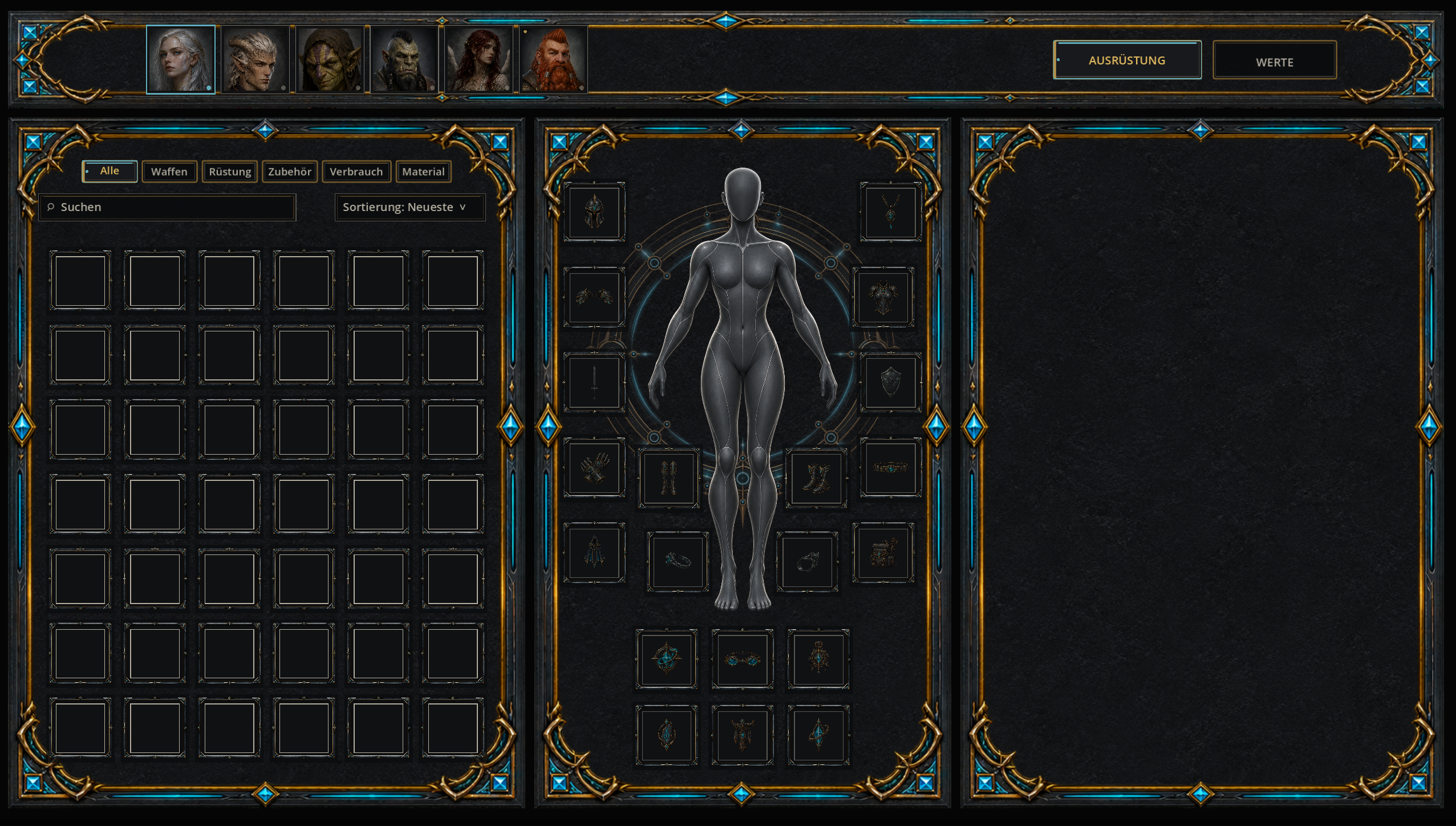
The inventory view is not only about displaying as many items as possible. It also needs to make it immediately clear what a character is wearing, which items are available, and where additional information can be found.
Inventory slots, equipment slots, filters, character presentation, and item information are therefore deliberately separated from one another while still feeling visually connected.
A key part of this work is finding the right balance between information density and visual calm. Inventory screens can quickly become cluttered when spacing, frames, and groups are not clearly structured.
Making character stats easier to understand
The character stats view also contains several different kinds of information. Primary attributes, derived values, and skills serve different purposes and therefore need a clear visual hierarchy.
Instead of placing everything in one long list, these areas are deliberately separated. This should make important values easier to find and changes easier to understand later on.
One shared visual language
Both interfaces use the same core Veildelve design language: dark forged metal, aged bronze and gold details, and restrained Aether accents.
The frames are not intended to be purely decorative. They help separate information areas and guide the player’s eye through the interface.
Another important part of the work lies in small details such as spacing, centering, slot placement, and deciding how much room each section actually needs. These seemingly minor adjustments often determine whether an interface feels calm and intuitive or unnecessarily complicated.
From interface to gameplay systems
The current visual state now provides the foundation for the next phase. Inventory, equipment, and character stats will be connected to the underlying gameplay systems.
The separation remains deliberate: the interface displays information and accepts player input, while rules, calculations, equipment logic, and other gameplay decisions are handled by the systems underneath.
Step by step, this creates an interface that should not only fit the visual identity of Veildelve, but also remain readable as more items, stats, and character options are added later.
Inventory and Equipment
The inventory view combines item management and equipment in a clearly structured interface. Slot spacing, filters, character presentation, and information areas are coordinated to keep the screen calm and understandable even when many elements are visible.
Current development statusCharacter Stats and Skills
The character stats view separates primary attributes, derived values, and skills into distinct areas. The goal is to make important information easy to scan without overloading the player with unnecessary elements.
Current development statusBoth views follow the same visual language and are designed to feel like parts of one coherent system.
The images shown come from the ongoing development of Veildelve. Individual content, values, and functional details may still change as development continues.